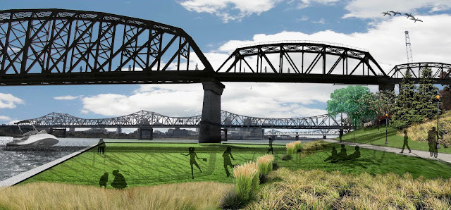
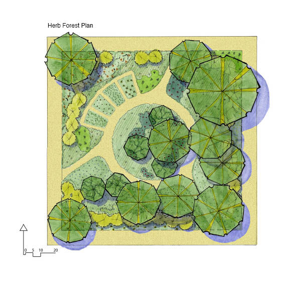
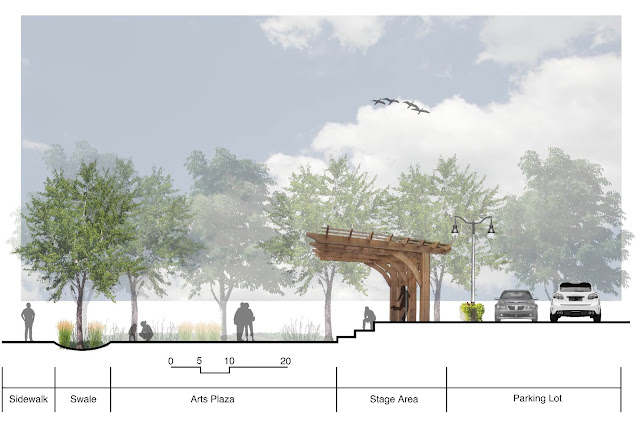
These sections are coming along nicely I believe. The top one is of the street relation of building fronts to the entry plazas, urban swale, sidewalk, and road. It was produced completely in photoshop. The bottom section is a autocad base of line work that shows that built swale. It needs to be labeled still, and serves as an illustrated detail drawing. I believe i am going to fade the color even more that currently, because it takes away from the linework, which was the purpose of the drawing, and it also looks too similar to the one above it.
Tuesday, April 9, 2013
Photomontage Perspective Updates
The final steps to these photomontages were to add more shade, shadow, and entourage. My favorite one is the first one. A dusk rendering of an amphitheater that has a floating stage and cantilever structure. I think that these images have come a long way, but i still see areas that i could improve on. The image of the ramp landing area is one where i just cant seem to get everything to come together and look cohesive. I think these images communicate my design effectively overall, and look well designed and though out when placed to images of the existing conditions.
Tuesday, April 2, 2013
Photoshop Sections
These sections were produces in photoshop with only a couple of hours of work on each one. As I do more and more they go faster and faster. They are becoming a quick and illustrative way to depict the separations of spaces.
Monday, February 25, 2013
LA 480 Final Photomontages
Final perspective images have been touched up and had minor changes made since the last submitted copies. The entourage has been touched up and made consistent and the shadows have been tweaked. Small details were the finishing touches on these perspectives.
Monday, February 18, 2013
LA 480 Unit 4.2 Spatial Diagramming 75% Complete
The beginnings of spatial analysis of the city context of Jeffersonville, Indiana along the waterfront of the Ohio River. Next steps for completion include inventory and analysis graphics to be overlaid. The Ohio River, interstate 65, north arrow, etc. will be added as additional layers to complete the analysis aspect and make the structures of the layers self standing and graphically legible.
LA 480 Unit 3.1 Photomontages 75%
Entourage, Shadows, and other slight touch ups have brought these photomontage perspectives to approximately 75% completion. The next steps for these images to reach completion is to add specific details that make the picture unique. Things I am thinking of are adding lights and vegetation to the pedestrian bridge of the third image, creating and interesting street scape in the middle image, and inserting a new floating stage structure into the top image. These additions of unique characteristics would make the images more distinguishable, and also represent more details of my design that will be incorporated into my project.
Wednesday, February 6, 2013
480 Unit 1 "Who Are You"
The diagram plan of the Brooklyn bridge park is a successful image of
depicting the project site that was bounded by the existing features of
the city. It is a simple and clean image of what is to be accomplished.
This is an image that i would consider a 'moneyshot'. It communicates
the designed spaces very well and without going into too much detail.
The image shows enough, but not too much. Images in this type of
landscape can often seem to become too cluttered of muddy with the
adjacent skyline and building infrastructure. The project site 'pops'
and stands out as an image that gives you a comprehensive look at the
project in its entirety.
These images are composed as perspectives and show the detailed
interaction and use of specific spaces within the project. I think that
these images are successful in giving a good sense of place to the
viewer by depicting these spaces in heavy use by patrons.
These last two images are diagrams that are paired with perspective
views. These drawings compliment each other extremely well and give you
a more complete understanding of where the space is located, how it is
intended to function, and how you can expect it to be used upon
completion.
I believe that all of these images are extremely good examples of
professionally composed graphics. They are all clean, functioning,
readable, and realistic. The combination of these drawings together
have given me a good understanding about the project and its goals, and
would be great examples for me to try and match in my own graphics this
semester and in my future career.
Tuesday, February 5, 2013
480 Unit 3 Early Stages of Diorama Development
These images of early diorama perspectives are coming in handy while trying to visualize what can happen in a space for my comprehensive project. The few images that I do have work well, but more types and varieties will be coming soon to fully explore some more unconventional and possibly inspiring activities.
Monday, February 4, 2013
480 Unit 2.2 25% complete photomontages
These three images are the beginnings of creating realistic photomontages that depict the Jeffersonville, IN waterfront. The first steps were to remove unwanted features that the sites already held such as light poles, hand rails, construction equiptment, etc. I am currently in the process of adding a variety of plant material, not really focusing on the exact species requirements or suitability of plants, but more on the form, texture, and placement. I think that this will give me a good base to edit later and inform conceptual design. I did not intend on these exact images to depict final design concepts, but only inform future decisions and encourage more realistic visualizations.
The next step for these images is to add a wide variety of active entourage into the scenes. Adding people into these images will really bring them to life and really show what I want to happen in these spaces. I also need to finish up some edges and add more variety of materials to some surfaces.
These images are beginning to come together, but are far from being considered "finished".
Monday, January 28, 2013
480 Unit 2.1
Brooklyn
Bridge Park in New York City is a Michael Van Valkenburgh project that is
currently under construction. This
project is something new for the public of New York city to enjoy, it has taken
a previously industrial area and altered it into an accessible waterfront for a
city that has a major lack of public park space. The site of this park is at the foot of the
Brooklyn Bridge. It is an area that has
been reestablished as a public space rather than an industrial area. It is this new trend of reclaiming underused
areas that is changing the way in which we view the potential for areas to be
designed. The process of creating a
photo collage perspective works extremely well in identifying and depicting the
areas of the project that have multiple uses, lively activities, and are focal
points of the design.
The scale of
this project is also depicted very well through the use of imagery. The site is shown at the human scale. Above you can see that the site features and
design elements all relate to the human scale, and not to the scale of the
massive bridge and skyline that dominate the background and horizon. This human scale is addressed in multiple
ways. There are both open and intimate
spaces. Spaces for public recreation,
and also spaces for individual use are found throughout the site. Pier 1 was the first section of the park to
be completed. It has a variety of
terrain that gives a unique sense of access to the water.
Pier 1 is
programmed to induce the enjoyment of the landscape through both direct contact
and through distant views. The large
open lawn with an immense uninterrupted view of the skyline is contrasted by
the intimate paths that wind down to access the water. This programming has created a variety of
spaces for people to enjoy no matter what type of recreation they are enjoying.
The images
produced in the design process of Pier 1 are extremely successful in showing
the dynamics of the space. The images
are made to show the wide variety of activity that can take place. This type of image shows the elements of the
site such as scale and terrain that have influenced the design. You can also see the cultural elements with
the large groups of people all inhabiting a small space. The ecology takes a back seat in this image,
but it is not left out. This image shows
the installations of vegetation, but it is not a focal point in this image.
These images
are successful in showing the analysis, discovery, system, tools, and processes
because of the multiple levels of design that they show. The human figures in all the images give a
very obvious depiction to whom and what the site is meant to function to at any
time. Whether it be active or passive
recreation, the meaning is clear as to what the space is meant to support.
The expression
of these spaces through these photomontage scenes provides a level of realism
to a conceptual design. The mixtures of
photographs and the implanted entourage give a extremely easily read image to
what is happening in the space. The multiple
layers including blurs and transparencies blend everything together to create a
large image with little seam work that you eye catches. The perspective is true and well positioned
to show multiple layers of design.
Michael Van
Valkenburgh Assoc. show in their perspective photomontages designs that are successful
and beautiful with people interacting in them.
That is the major feature that I keep seeing in the photomontages form
all of their project images. The
insertion of these vast amount of people make you automatically believe that
the space is vibrant, lively, successful, and loved by the community, even
though it may not even be constructed yet.
I think that this is a huge accomplishment for a simple
photomontage. The insertion of people interacting
seems to be more important than the actual depiction of the minute design
details. I think that the success of
these images it to make it obvious in the image that the space that you are
pitching or depicting is made to seem useable, loveable, respected, and a focal
area.
When
creating these images I think that there is a lot of freedom to really let your
creative take hold and express what a space has the potential to be. Detail and schematic drawings can only get
you so far in expressing how a space is intended to feel and be
experienced. With a successful
photomontage the character of a space can be expressed. A detail drawing, and even artistic drawings
most of the time, struggle to represent and show the amount of detail that a
photomontage can.
I think that
the use of photomontages can easily depict and support the different layers of
design such as site, scale, terrain, ecology, culture, analyses, discovery,
tools, systems, performance, and can exponentially enhance the ability to
communicate ones design to clients and viewers of any education or
background. They are truly a visual tool
that, if used correctly, can give views into your design that cannot be achieved
in any other form of visual aid. I think
that using a tool such as photo shop to create these images will soon trump the
hand drawing process, if it already hasn’t, in terms of effectively visualizing
a concept.
Subscribe to:
Comments (Atom)


